Basic Graphing
Ben Miner and Matthew Zinkgraf
2022-09-21
Basic graphing
To give you an idea of what you can do in R, let’s make some graphs. Basic graphing in R is very simple. Here are a couple of functions to easily generate simple graphs in R.
- plot
- Creates a scatterplot between two continuous variables, or a boxplot between a categorical x variable and continuous y variable.
- boxplot
- Creates a boxplot.
- barplot
- Creates a barplot.
- pie
- Creates a pie chart.
- hist
- Creates a histogram of a numerical vector.
1 Create graphs
Let’s open up a new script file and create a few graphs. We will
create three variables: pops, height, and weight so we have something to
graph. For fun, let’s assume the fake data we make up in a minute are
from two populations of the species
#the function rep repeats a vector
#below we repeat the vector c("Pop 1", "Pop 2") 25 times
pops <- rep(c("Pop 1", "Pop 2"), 25)

#converts the data to a categorical variable
pops.fac <- factor(pops)

#view the data
pops
## [1] "Pop 1" "Pop 2" "Pop 1" "Pop 2" "Pop 1" "Pop 2" "Pop 1" "Pop 2" "Pop 1"
## [10] "Pop 2" "Pop 1" "Pop 2" "Pop 1" "Pop 2" "Pop 1" "Pop 2" "Pop 1" "Pop 2"
## [19] "Pop 1" "Pop 2" "Pop 1" "Pop 2" "Pop 1" "Pop 2" "Pop 1" "Pop 2" "Pop 1"
## [28] "Pop 2" "Pop 1" "Pop 2" "Pop 1" "Pop 2" "Pop 1" "Pop 2" "Pop 1" "Pop 2"
## [37] "Pop 1" "Pop 2" "Pop 1" "Pop 2" "Pop 1" "Pop 2" "Pop 1" "Pop 2" "Pop 1"
## [46] "Pop 2" "Pop 1" "Pop 2" "Pop 1" "Pop 2"pops.fac #compare the output from pops## [1] Pop 1 Pop 2 Pop 1 Pop 2 Pop 1 Pop 2 Pop 1 Pop 2 Pop 1 Pop 2 Pop 1 Pop 2
## [13] Pop 1 Pop 2 Pop 1 Pop 2 Pop 1 Pop 2 Pop 1 Pop 2 Pop 1 Pop 2 Pop 1 Pop 2
## [25] Pop 1 Pop 2 Pop 1 Pop 2 Pop 1 Pop 2 Pop 1 Pop 2 Pop 1 Pop 2 Pop 1 Pop 2
## [37] Pop 1 Pop 2 Pop 1 Pop 2 Pop 1 Pop 2 Pop 1 Pop 2 Pop 1 Pop 2 Pop 1 Pop 2
## [49] Pop 1 Pop 2
## Levels: Pop 1 Pop 2#set the random number generator value so we all generate the same "random"" numbers
set.seed(340)
#create some fake data
#the function rnorm returns 50 random values from
#a normal distribution with a mean of 66 and
#standard deviation of 10
height <- rnorm(50, 66, 10)
height## [1] 64.42627 54.01142 57.10795 76.09061 72.13041 76.07151 70.14432 47.42090
## [9] 52.51271 71.18858 64.25402 67.98799 66.56160 53.52329 68.31766 68.20342
## [17] 61.10326 74.14436 49.74779 57.74989 76.61589 65.88765 58.68682 67.60547
## [25] 80.25601 63.95558 77.90892 80.03427 72.12747 75.30074 58.85061 67.57077
## [33] 74.72140 79.25436 75.26808 66.88326 49.52440 59.57881 67.91653 71.75655
## [41] 73.77299 70.00641 56.17083 65.19871 54.28446 72.92145 56.23643 65.35393
## [49] 49.24887 84.95153#create 50 values for a normal distribution with
#a mean of 150 and standard deviation of 30
weight <- rnorm(50, 150, 30)
weight## [1] 108.60529 196.31624 94.02019 160.88119 146.64691 157.46697 152.04334
## [8] 165.75198 129.70893 168.98670 145.37322 139.83507 153.86344 145.42175
## [15] 94.54780 215.38553 164.84327 166.03424 128.26357 189.63380 106.48963
## [22] 146.55196 146.99079 105.38672 167.37810 200.27634 153.32093 170.04754
## [29] 148.12770 205.46059 146.90167 192.54807 164.42083 163.26025 166.71892
## [36] 89.80435 137.71173 118.36248 129.63432 97.31389 113.28371 141.13142
## [43] 98.10233 90.89994 187.47154 66.12106 124.68121 129.82921 124.67514
## [50] 156.02163Now let’s make some graphs.
1.1 The function plot()
plot(height~weight) 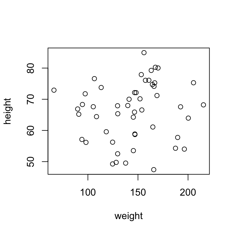
The first argument in many plotting functions can be given as a formula. In R, a formula is similar to the how statistical models are written. The response variable is always on the left side of the equation and is plotted on the y-axis. The predictor variable is always on the right side of the equation and is plotted on the x-axis. The tilde “~”, which is in the upper left corner of your keyboard represents the equals sign in the equation. R will make decisions about what type of plot to create, based on the type of the data. For example, above the response and predictor variables are both continuous, so R plots the data as a scatterplot. Below I use the function plot again, but provide a continuous response variable and a categorical variable in the formula. R now plots a box plot. Of course you can also use the function boxplot() instead of the function plot().
plot(height~pops.fac)
boxplot(height~pops.fac) #same as the above plot
1.2 The function barplot()
For some plots, like barplots and pie charts, you need to provide just one value of each group. In in the case of our fake data, we have two groups, female and male. However, we have lots of numbers for each group. So, we can use the function tapply() to quickly calculate the mean (or another metric) for each group. In the example below, we first calculate the mean heights for each group. Then we plot the means.
#Calculate the means
pop.mean.heights <- tapply(height, pops.fac, mean)
pop.mean.heights
## Pop 1 Pop 2
## 64.31583 68.10606#Plot the means
barplot(pop.mean.heights)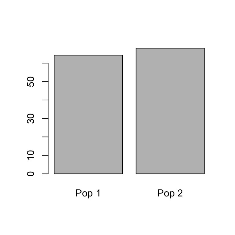
The function to calculate the standard deviation is sd(). Try to modify the code in the first line above to calculate the standard deviation for populations 1 and 2. You can check you answer against the code below.
#Calculate the sd
pop.sd.heights <- tapply(height, pops.fac, sd)
pop.sd.heights
## Pop 1 Pop 2
## 9.685328 8.838307In the function barplot(), the argument to change the labels is names.arg and it takes a vector of strings. Make sure to put the labels in the correct order. In the example, above “Pop 1” is the first value in pop.mean.heights.
barplot(pop.mean.heights, names.arg = c("Population 1", "Population 2"))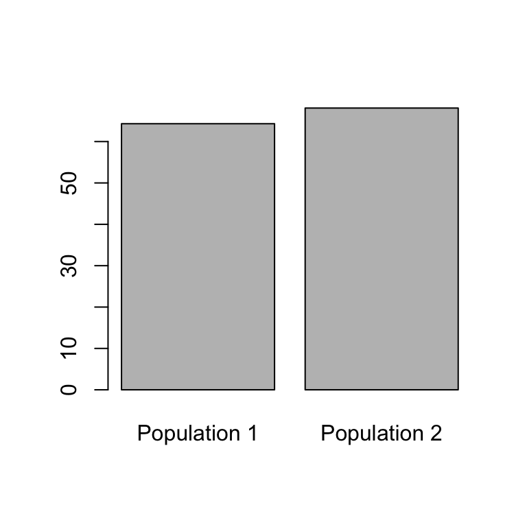
1.3 The function pie()
pop.mean.weights <- tapply(weight, pops.fac, mean)
pie(pop.mean.weights)
In the function pie(), the argument to change the labels is label and it takes a vector of strings. Make sure to put the labels in the correct order. In the example, above “Pop 1” is the first value in pop.mean.heights.
pie(pop.mean.weights, label = c("Population 1", "Populations 2"))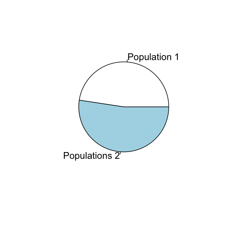
You might be wondering how to add error bars. Check out the Advance Graphing lab for information about error bars.
1.4 The function hist()
In the function hist(), only one argument is required to create a histogram–a numerical vector. There are optional arguments to change to the breaks and other aspects of the histogram.
hist(weight)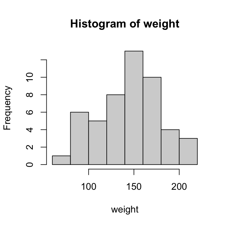
hist(weight, breaks = 4)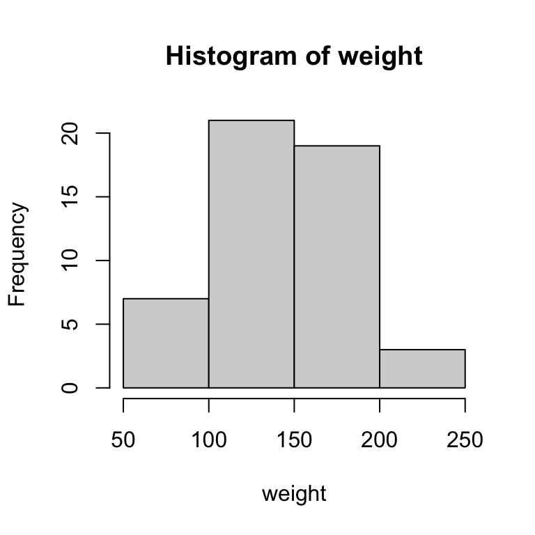
2 Modify graphs
Now let’s spruce up the graphs a little. There are additional arguments to modify the graphs. Many of these arguments are general and can be used with any of the functions above.
- main
- Specifies the title of the graph.
- sub
- Specifies the subtitle of the graph.
- xlab ylab
- Specifies the axis labels.
- xlim ylim
- Specifies the axis limits.
- col
- Specifies the color of the graph.
- pch
- Specifies the symbol of the points on the graph.
- cex, cex.axis, cex.main
- Specifies the size of the points or text in the graph. A value of greater than 1 increases the size.
- asp
- Specifies the y/x aspect ratio of a plot.
Change the title and subtitle of a graph with the main and sub arguments.
plot(height~weight, main = "My Sweet Graph", sub = "Created by Ben")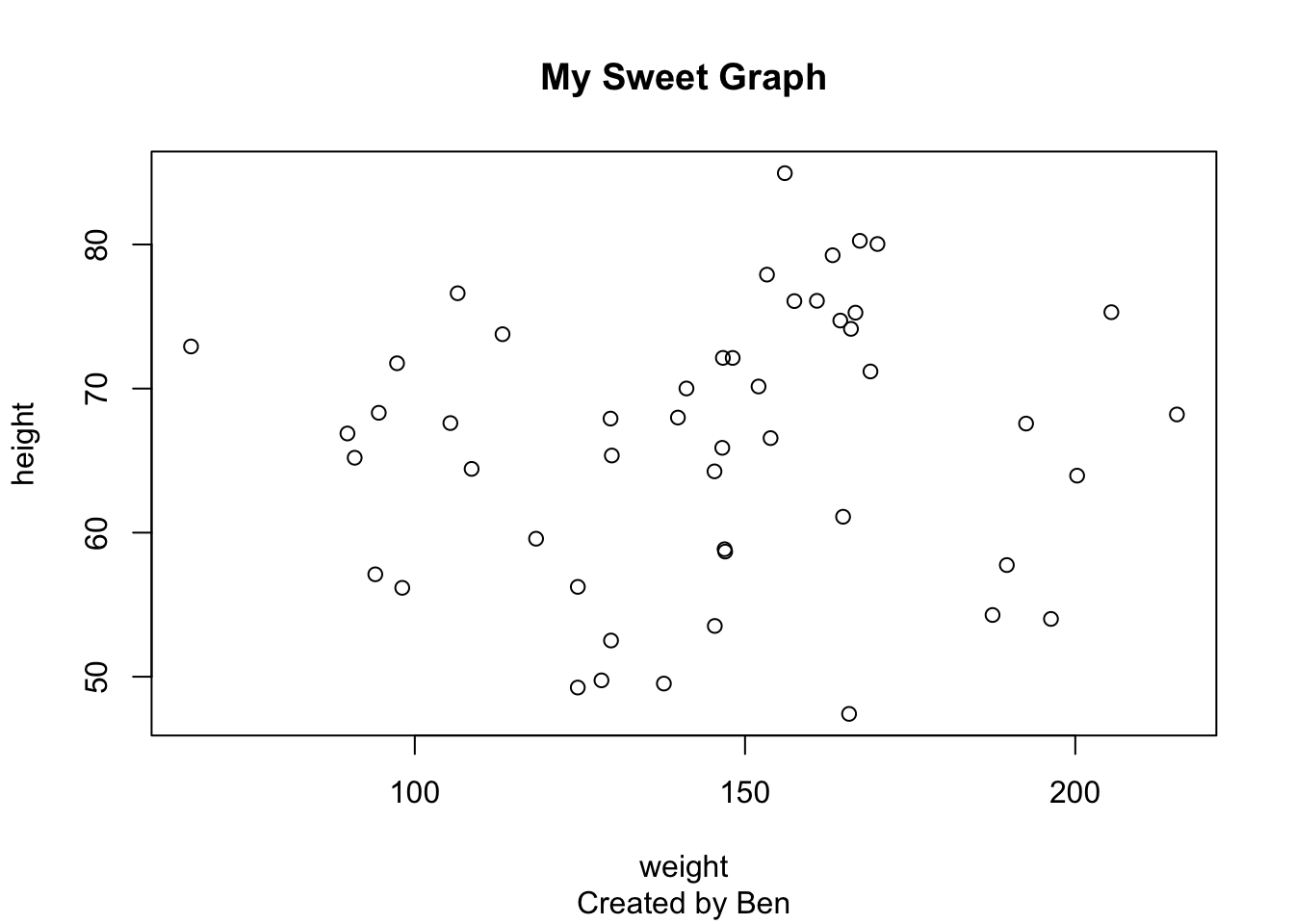
Change the axis labels with the xlab and ylab arguments.
plot(height~weight,
   main = "My Sweet Graph",
   xlab = "Weight (mg)",
   ylab = "Height (mm)")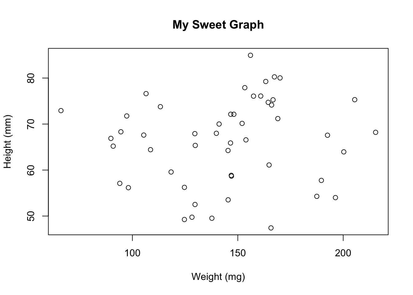
Change the size of symbols, axes, and axis labels with the cex, cex.axis, cex.lab, and cex.main arguments.
plot(height~weight,
   main = "My Sweet Graph",
   xlab = "Weight (mg)",
   ylab = "Height (mm)",
   cex = 1.5, cex.axis = 1.5, cex.lab = 1.5, cex.main = 1.5)
Change the type and color of the symbols with the pch and col arguments.
Use the function colors(), which requires no arguments, to see all the built-in colors in R.
plot(height~weight,
   main = "My Sweet Graph",
   xlab = "Weight (mg)",
   ylab = "Height (mm)",
   cex = 1.5, cex.axis = 1.5, cex.lab = 1.5, cex.main = 1.5,
   pch = 15, col = "goldenrod3")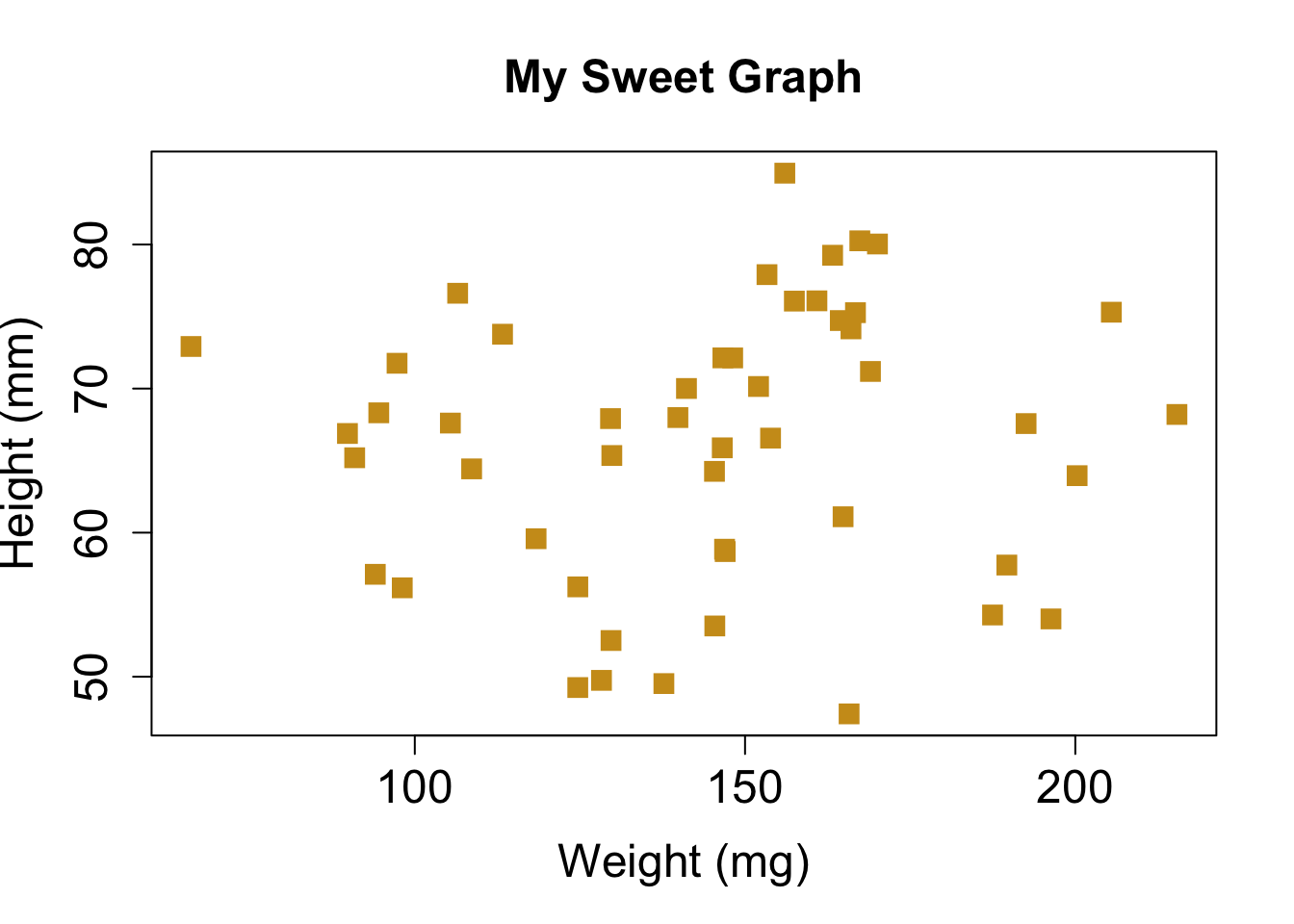
Change the scale of the axes with the xlim and ylim arguments.
plot(height~weight,
   main = "My Sweet Graph",
   xlab = "Weight (mg)",
   ylab = "Height (mm)",
   cex = 1.5, cex.axis = 1.5, cex.lab = 1.5, cex.main = 1.5,
   pch = 15, col = "goldenrod3",
   xlim = c(0,500), ylim = c(0,100))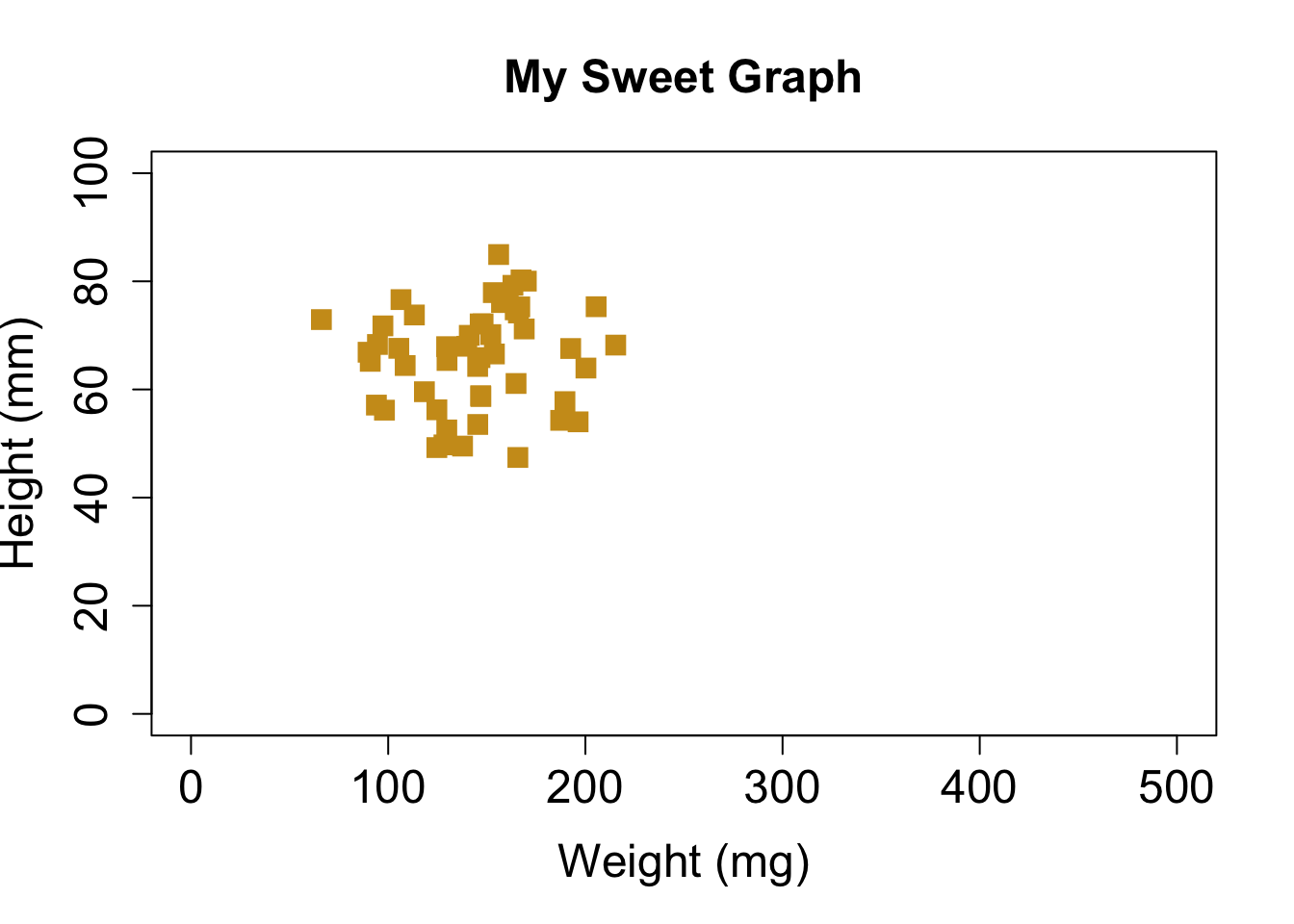
For more arguments that modify graphics, type in
?par, which represents the parameters for graphics. There
are a lot, and it is overwhelming at first, but you will start to become
comfortable with many of these arguments.
3 Save graphs
You might also want to save a graph for a class assignment, presentation, or publication. In R, there are drivers that create a file of your graph (e.g., jpg, bmp, pdf, or png file). There are two functions I commonly use to save graphs, pdf() and png(). Each driver function has slightly different parameters, so look at the help files to see what options are available.
First, let’s tell R where to save the file, by setting the working directory with the function setwd(). Alternatively, in RStudio, you can go to Session > Set Working Directory > Choose File. Of course you welcome to set the working directory somewhere other than you u drive.
getwd()       #indicates where the file will be saved
setwd("u:/")  #sets the working directory to your u drive
Now let’s create a pdf. First, we turn on the pdf driver with the function pdf() and use the arguments paper to set the paper size and pointsize to set the font size. The first argument is the name you want to assign to the file, and it includes the extension and is surrounded by quotes. At the end we turn off the driver with dev.off().
pdf("my first graph.pdf", paper = "letter", pointsize = 12)
plot(height~weight,
   main = "My Sweet Graph",
   xlab = "Weight (mg)",
   ylab = "Height (mm)",
   cex = 1.5, cex.axis = 1.5, cex.lab = 1.5, cex.main = 1.5,
   pch = 15, col = "goldenrod3",
   xlim = c(0,500), ylim = c(0,100))
dev.off()
Look in the working directory and open your new graph. You are now officially a nerd!!
So, that is it for the introduction. Check out the Advanced Graphing and GGPlots labs for more information about how to create graphs in R.